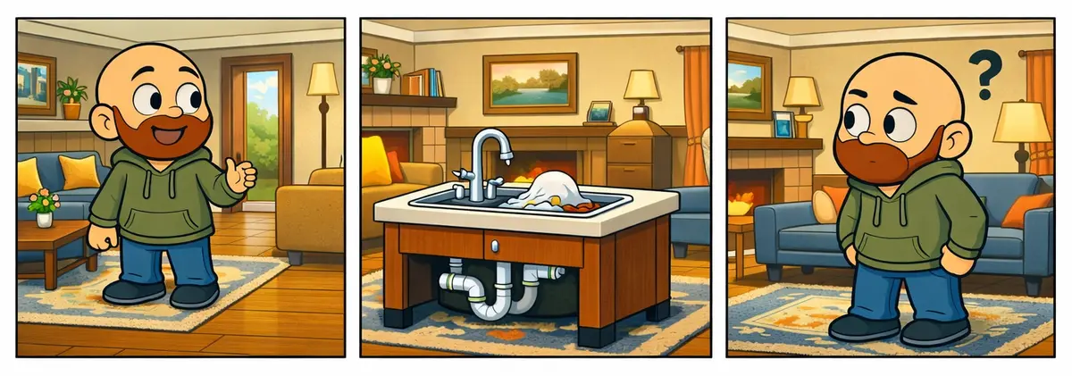
A Sink in the Living Room
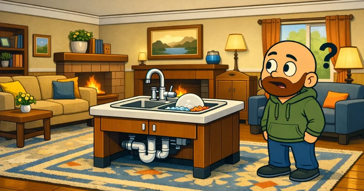
Every once in a while you walk into a house and something feels off. The furniture is arranged nicely. The colors look good. Everything seems intentional. Then you turn the corner and see a full kitchen sink sitting in the middle of the living room. It works. It is functional. But it clearly does not belong there.
Some logos on websites feel exactly like that.
They are blurry. They are oversized. They sit awkwardly on top of the design instead of feeling like part of it. The rest of the site might look great, but the logo pulls you out of the experience the same way a misplaced sink would.
When the Logo Is in the Wrong Room
A logo should feel like it belongs in the space. It should fit the layout, match the style, and support the design. When it is unclear or not sized correctly, it creates a strange tension. Visitors may not know why the page feels off, but they sense the mismatch.
It is the same feeling you get when you see plumbing where a coffee table should be.
The Problems a Misplaced Logo Creates
A logo that does not fit the space creates a ripple effect.
The header becomes taller than necessary. The navigation feels squeezed. The first section of the page starts lower than it should. The entire layout feels heavier than the content.
These are small issues, but they shape the first impression. A visitor should notice the business, not the awkward placement of the brand.
Why It Matters
Your logo represents your identity, but your website represents the experience people will have with you. When the logo looks out of place, it sends the message that the details were not fully considered. Even if the work you do is excellent, the first impression becomes weaker.
A well prepared logo does the opposite. It blends into the layout. It supports the design. It helps the site feel intentional and trustworthy.
How to Make the Logo Feel Like It Belongs
You do not need a new logo. You just need the right version of it.
A sharp, high resolution file. A horizontal layout that fits comfortably in a header. A size that feels balanced with the navigation. A version that works on both light and dark backgrounds.
These small adjustments help the brand feel like it was built into the home instead of dropped into the living room as an afterthought.
Final Thoughts
Your logo should feel like it belongs in the space. When it is clear, sized well, and integrated into the design, the whole site feels more polished. A balanced header sets the tone for everything that follows, and visitors can focus on the story you are trying to tell instead of wondering why the sink is in the wrong room.
Is This Place Still Alive?
A quiet, untouched website starts to feel like an empty house, and small, consistent updates are the signs of life that keep it feeling lived‑in and trustworthy.
Two Paths, One Product
Why makers should let marketplaces bring customers in and let their own store bring them back.