Just Because We Can Doesn’t Mean We Should
Modern web tools are incredibly powerful.
With just a few lines of code we can animate almost anything on a page. Buttons can bounce. Cards can flip. Backgrounds can move. Entire sections can fade, slide, spin, and react as the user scrolls.
Frameworks and animation libraries make this easier than ever. What once required complex JavaScript can now be done with a few classes or configuration options.
But there is a subtle trap hiding inside all that power.
Sometimes we stop asking whether something should move, and only ask whether it can.
The Temptation of Motion
Animations can make a site feel polished and modern. When used thoughtfully, they guide the user and add helpful feedback.
A subtle hover animation can tell a visitor:
“Yes, this is clickable.”
A smooth transition can help a user understand:
“You moved from this section to that one.”
Small touches like these make interfaces feel natural.
The problem begins when everything starts moving.
- Text slides in.
- Cards bounce.
- Icons spin.
- Backgrounds shift.
- Scroll triggers fire everywhere.
Instead of guiding attention, the page begins competing with itself.
The user came to read something or complete a task. Instead, they are watching a small animation show.
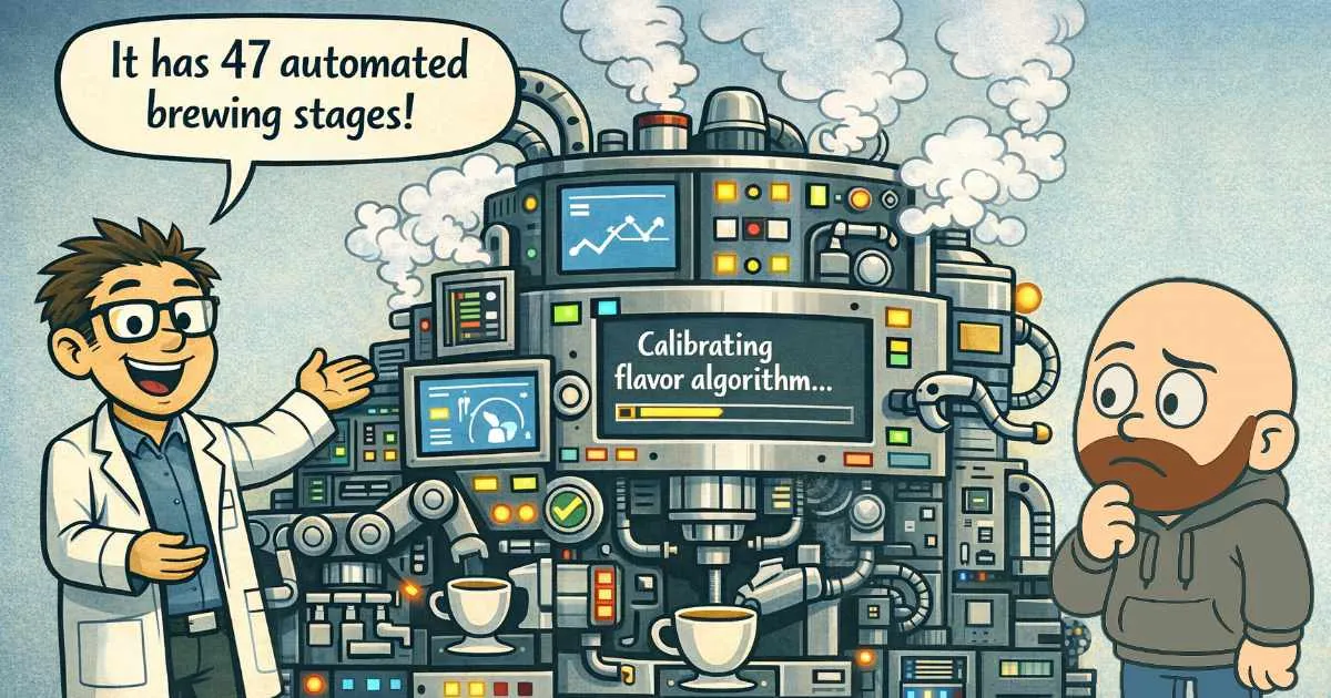
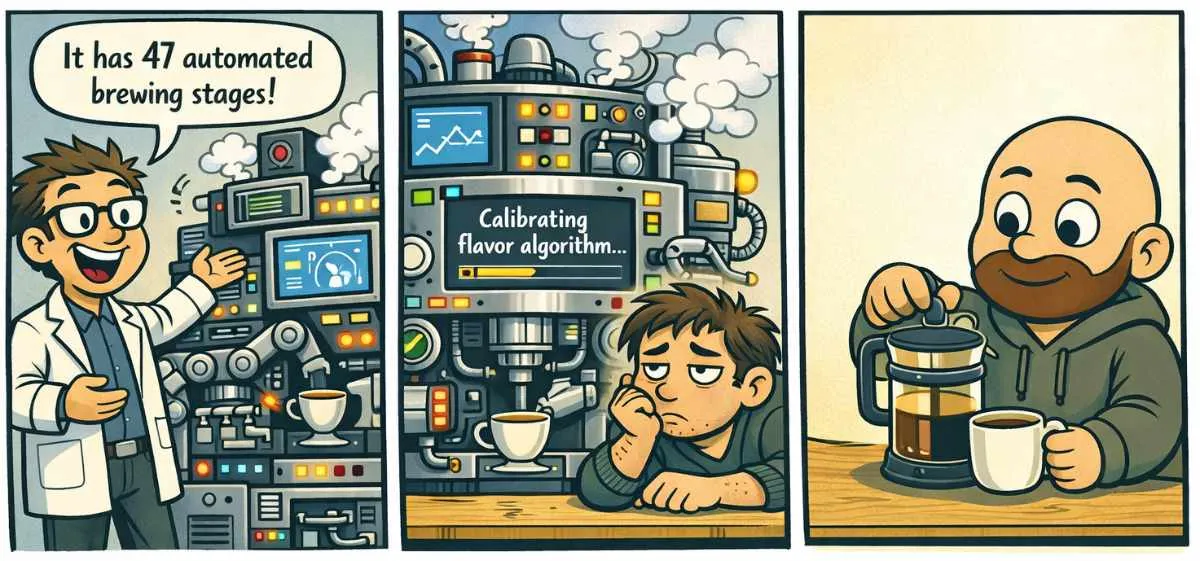
The Coffee Maker Problem
Imagine someone proudly showing off a new coffee machine.
It has screens, sensors, tubes, robotic arms, and dozens of automated stages. It can calibrate temperature, pressure, and flavor profiles with impressive precision.
Technically, it is amazing.
But while it calibrates its flavor algorithm, the person waiting for coffee is still waiting.
Meanwhile, next to it sits a simple French press making a perfectly good cup in seconds.
Sometimes the simpler tool wins not because it is more powerful, but because it is more focused.
Websites can fall into the same trap.
Good Animation Has a Purpose
The best animation on a website often goes unnoticed.
It simply helps the interface feel responsive and clear.
A few guidelines I try to follow:
Animate with intention
Most animations should serve a purpose. They can guide attention, confirm an action, or help users understand how an interface works.
A small decorative animation can also add personality and make a site feel alive. The key is restraint. When motion is subtle and occasional, it enhances the experience instead of distracting from it.
Keep movement subtle
Small transitions usually feel better than dramatic effects.
Avoid motion overload
If everything moves, nothing stands out.
Respect performance
Heavy animation can slow down a site, especially on mobile devices.
Respect the user
Some visitors prefer reduced motion for accessibility reasons.
The Goal Is Clarity
A good website does not try to impress visitors with how much it can do.
It focuses on helping them quickly understand what they came for.
Animations should support that goal, not compete with it.
In other words:
Just because we can animate everything…
doesn’t mean we should.
Final Thoughts
Complexity can be impressive, but most visitors just want a smooth, clear experience. Sometimes the digital equivalent of a simple French press is exactly what a website needs.
Visitors Trust Companies That Protect Them
A secure website builds trust. Regular checks keep your visitors safe and your reputation strong.
When Every Website Looks the Same
Many websites are built from the same templates, creating a neighborhood of identical designs. A custom website helps your business stand out.